Wednesday, March 26, 2008

Fish Ease

When I designed Fish Ease I tried to push myself in a direction of packaging products that I would not normally choose to do. I chose something I was not interested in and made myself interested in it. It was to appeal to an older generation as a look from the past, and a younger generation as vintage. To create this effect I combined an old-fashioned color scheme, vintage texture, larger drop shadows, and older looking images. My objective was to make the text and imagery look like an old fashioned poster with modern elements.


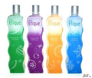
Etique Water

This packaging design assignment was a redesign of an existing product. I choose a Sam’s Choice water and made it into a high class looking water bottle. It was difficult trying to make a water bottle look expensive yet be able to sell it to an average buyer. Etique’s simple and sleek design makes this possible.


Velvet Candle Company

This packaging design assignment was to design something that was elegant. I tried to come up with a name that sounded elegant and then go from there with the design, so I chose Velvet Candle Company.


Remembering 9/11

This was a web site that we were to create an organized time line of the 9/11 events. I wanted to keep the focus of the site on the images of the actual happenings and have them draw you in to read the time line.


Portfolio Web Site

This is a sample of my own portfolio web site jessica mac design. I wanted the look and feel of my portfolio web site to reflect the style of design that I enjoy doing; I like it to be simple, clean, but fun and interactive


.

Saul Bass Web site

This was a web site that I chose to do on Saul Bass. I did research on Saul Bass’s designs and I wanted my web site to reflect his style of design. It was very educational for me to study another graphic designers style of design and try to mimic.


Titleist Commercial

(Motion Graphics- After Effects)
This was a commercial for Titleist Golf. I wanted the commercial to be upbeat and entertaining but also to catch the attention of the more conservative golfers.

Forrest Gump– Intonation Piece

(Motion Graphics-After Effects)
This was an intonation assignment for a motion graphics piece. I chose a segment from Forrest Gump and tried to portray his journey across the United States.

Timberland– Animated Logo

I chose Timberland as my animated logo brand because it has a good design to start off with and I thought it would be fun to work with. I wanted to choose something that reflected the design that Timberland already had. I kept it very simple and clean so the focus would be directed towards the logo. (After Effects)

Sweet Boutique

This assignment was to come up with our own subject and scope of the project. It was during Christmas time and I wanted to do something festive. Sweet Boutique was meant to be sold in boutique’s and small candy shops. It was difficult to find something that was festive but looked inviting to eat, and also would look like it was expensive.


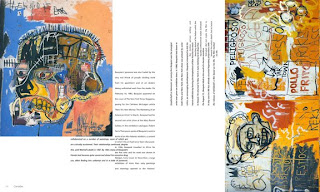
Consider Magazine

Consider magazine was one of my favorite and most difficult projects. The assignment was to push ourselves in a direction out of the ordinary; something you do not see everyday. I took this far in some of my articles and I learned a lot from it. Through this I became more interested in different types of design.


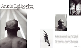
Pause Magazine

This assignment was to create an art magazine that incorporated many different kinds of art. The name Pause was chosen because I think that art sometimes is a ‘pause in time” and I thought that the name would fit well with what I had in mind.


VAMP

Vamp was an assignment given in which we were supposed to create a catalogue for a company. I wanted to create my own company that sold many different types of designers in one catalogue. I wanted this to be a high fashion catalogue , so I chose imagery and clothing designers that reflect a high class fashion.